I frequently hear the saying "mobile first." It's how startups turn small ideas into companies, and people all over the world communicate like never before. But is it something you think of when designing online and blended courses?
In Higher Education, smartphone ownership is between 85-99% at most institutions, with tablets proving to be popular in K-12 with many successful 1:1 programs. At UCF, our research shows that students rely on mobile devices, particularly smartphones, to engage in the learning process. In our 2016 Mobile Survey, 82% of students reported using smartphones to support their learning. Easier access to coursework was the main reason (74%), with heightened communication with other students (66%) and their instructor (65%) following close behind.
For many of our students, Canvas, and especially the Canvas Mobile app, is at the heart of their learning experiences. At UCF, we conduct an annual Canvas Mobile app survey to better understand how students and teachers are using the app. We started these surveys in 2014, and after four years, one thing is clear: the app is as popular as ever, with usage at 90%. The majority of this usage (82%) is at least once a week, and using Canvas on their smartphones was very to extremely important for 70% of student respondents.
These stats are very informative and illuminate the importance of mobile in the learning experience, but as an instructional designer, how do I work with teachers to think mobile first? I use the following mobile design suggestions to optimize their courses for mobile users:
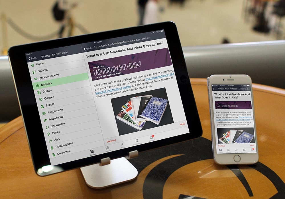
1. How is content being chunked to the user?
I often talk about the “distracted environment” of a mobile user, especially for young adult learners. Mobile users spend less time in one place and tend to multitask. Between notifications, text messages, phone calls, and their natural tendency to quickly jump into another app, it’s harder to hold attention and for the user to spend a long time doing one task. At UCF, the average user spends 14 minutes per session in Canvas with a laptop or desktop and 10 minutes on a tablet, but only 5 minutes on a smartphone. The typical college student can read around 300 words a minute on a mobile device, so I focus on 1500-3000 words per page so content can be read in under 10 minutes. Chunking content to meet the mobile user doesn't require limiting or removing course content. If it’s important to the objectives, it needs to be included. My solution is to break up content into Pages and create a table of contents. This can be done through system tools, like Modules. This makes it easier for the students to quickly jump in and out of the content.
2. What is your choice of media?
This is another area where improvements have been made over the last decade, but there are still two big offenders: Flash and Java. These file formats don’t work on mobile devices, and if an instructor depends on them for her content, it can cause issues for students. Luckily, there are some great formats for mobile. This includes HTML5, H.264 or MPEG4 for video and animations, and MP3 audio will work on practically any mobile device. There are also some great mobile-friendly services out there, like YouTube and Vimeo for video and SoundCloud for audio. In Canvas, if you upload video or audio into the media comments tool, it will convert these into a mobile friendly format, similar to YouTube.
3. What file types do you use for content?
Word documents, PDFs, PowerPoints, and other popular file formats were developed a long time before mobile devices existed. Even though there have been some improvements in how to edit these documents on mobile devices, they still don’t create a great reading experience on mobile devices. When possible, move content into a Canvas Page. They are easier to edit and responsive for mobile devices.
4. What are your file sizes?
When creating content for mobile users, it’s important to be mindful of file sizes. I typically focus on files no larger than 50MB. Most users don’t have unlimited data plans, and therefore conserve their data plan for personal use. Even though there are opportunities to connect to wifi networks at school and other public places, it might not be available at home or when learning occurs. It is not uncommon for a subset of users to have the smartphone as their only internet-connected devices. If you asked most college students to choose between their smartphone or a laptop, it’s typically going to be the phone.
5. How are you prompting students to interact with content and assignments?
When you offer the same content on the web and mobile, it’s important to avoid directions unique to the user interface. For instance, on the web, you might say, “click the submit assignment button above,” but in a mobile app, this button might not exist, or does in a different place. This can confuse students. It’s best to keep your student prompts simple, consistent, and neutral to the interface.
6. Are you informing students when content isn’t mobile-friendly?
For various reasons, there might be times that content isn’t mobile friendly, and that’s okay. Not all of the best resources are mobile friendly yet. This is why it's important to inform your students when this is the case. Students expect things to work on mobile, but can be very forgiving if they understand why it doesn’t and how to plan around these situations.
In my previous Keep Learning blog, I discussed that students are using mobile devices, even if you aren't. More than ever, this still holds true. Course design with mobile design elements is crucial in creating the best universal experience, regardless of platform. For designers and instructors, it's time to think "mobile first."
Keep learning,
Ryan Seilhamer
Instructional Designer, University of Central Florida
Related Content
 tl_assessment_blog.jpg
Blogs
 ai_translation_blog_2.jpg
Blogs
 ai_literacy_blog.jpg
Blogs