
Mastery by Instructure Brand
Logo (Horizontal)
Usage Rules
-
The Mastery by Instructure logo consists of Mastery green (PMS 347C) and darkest blue (PMS 533C).
-
Whenever possible, place the logo on a light background.
-
It’s a friendly logo, but it has a personal bubble, so always give it plenty of breathing room.
To the right, you’ll see the minimum logo clear space and minimum size requirements. The logo and wordmark were made for each other, and should appear together whenever possible.
Co-Branding
When using a Mastery brand logo that includes “BY INSTRUCTURE,” you don’t need to incorporate the combined Instructure logo and wordmark into your design. However, please include the Instructure single mark—in color whenever possible or in reversed/white when it’s not possible. See the co-branding section for examples.
Horizontal Logo and Wordmark

Single Mark
Reversed
Logo Clear Space
Logo Minimum Size
Logo
(Stacked)
Usage Rules
Sometimes a vertically oriented Mastery by Instructure logo better fits the space. To the right you’ll find the minimum logo clear space and minimum size requirements.
Stacked Logo and Wordmark

Logo Clear Space
Logo Minimum Size
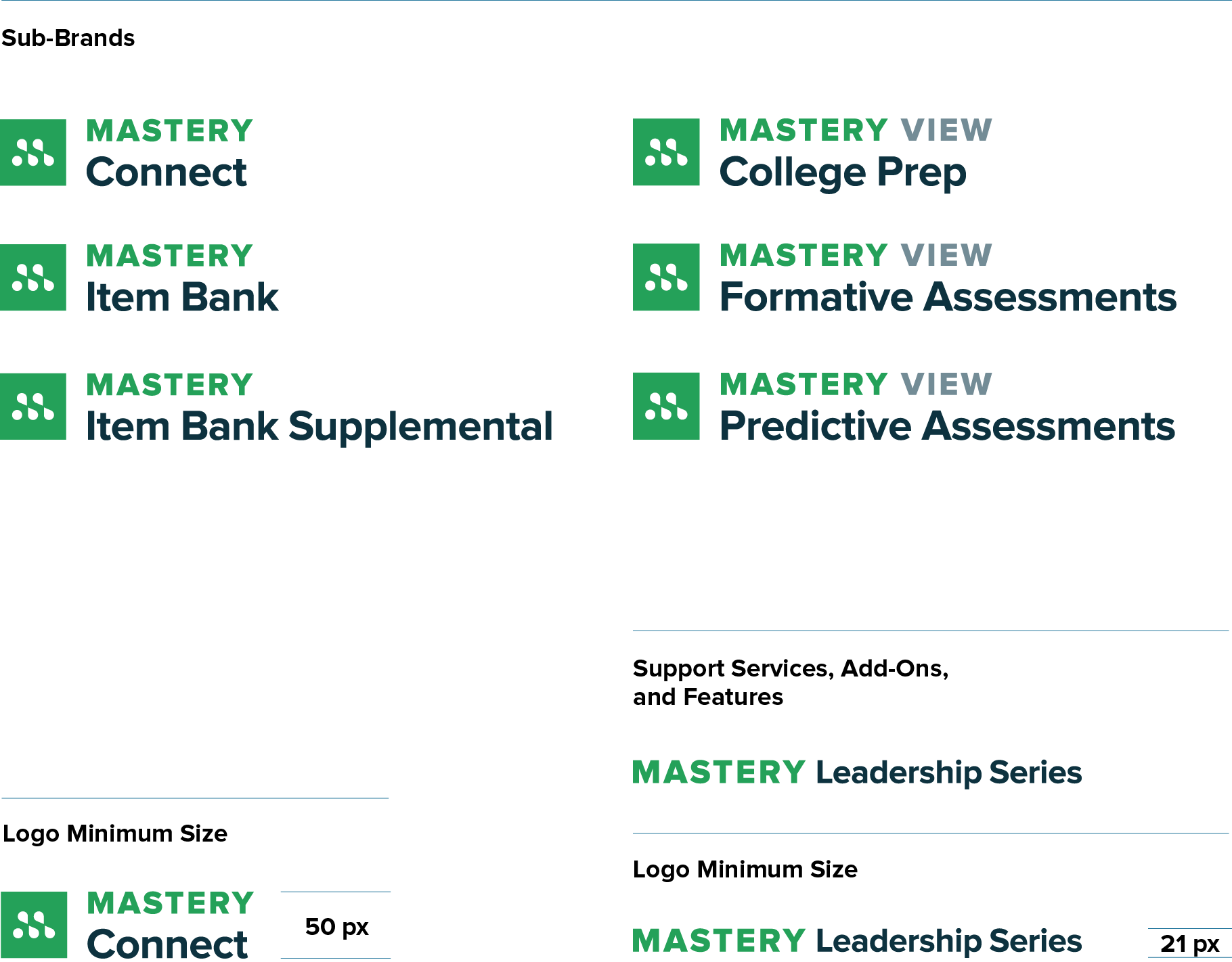
Logos
(Sub-Brands + Services)
Usage Rules
These Mastery sub-brands follow the Mastery by Instructure main logo color and clear space rules.
Co-Branding
When using an Mastery sub-brand logo that doesn’t include “BY INSTRUCTURE,” you must integrate the combined Instructure logo and wordmark into your design, preferably in color. See the co-branding section for examples.
Color Palette
Primary Colors
The Mastery by Instructure brand has three primary colors, chosen for both aesthetic and accessibility purposes. They’re Mastery green (PMS 347C), purple (PMS 258C), and Instructure blue (PMS 2149C).
Secondary Colors
Our secondary colors are for supplementary use—in outlines, buttons, divisions, illustrations, and color accents. The little things. Our handy “Palette Usage” graphic will help you determine usage frequency.
White Space
We give our colors room to breathe. So embrace the white space.
Primary Colors
-
H 24A159
R 36
G 161
B 89PMS 347C
C 85
M 10
Y 90
K 0 -
H 39B7D7
R 57
G 183
B 215PMS 2915C
C 65
M 10
Y 5
K 0 -
H 287A9F
R 40
G 122
B 159PMS 2149C
C 85
M 45
Y 25
K 0
Secondary Colors
-
H E72429
R 231
G 36
B 41PMS 1788C
C 0
M 100
Y 95
K 0 -
H F68E20
R 249
G 142
B 32PMS 144C
C 0
M 55
Y 100
K 0 -
H FACB13
R 250
G 203
B 19PMS 109C
C 0
M 20
Y 100
K 0 -
H 43CA9E
R 67
G 202
B 158PMS 338C
C 65
M 0
Y 50
K 0 -
H 0097D3
R 0
G 151
B 211PMS 2193C
C 80
M 25
Y 0
K 0 -
H 8D4EA5
R 141
G 78
B 165PMS 258C
C 50
M 80
Y 5
K 0 -
H CC1B5D
R 204
G 27
B 93PMS 205C
C 15
M 100
Y 50
K 0
-
H 0D323F
R 13
G 50
B 63PMS 533C
C 90
M 65
Y 50
K 50 -
H 143D50
R 20
G 61
B 80PMS 534C
C 90
M 65
Y 50
K 40 -
H 156380
R 21
G 99
B 128PMS 7700C
C 90
M 55
Y 35
K 20 -
H CCDCE4
R 204
G 220
B 228PMS 2707C
C 15
M 5
Y 5
K 0 -
H F2F8FA
R 242
G 247
B 250PMS 656C
C 6
M 2
Y 2
K 0
Palette Usage
Color Applications
There is no audience-based color segmentation for Mastery by Instructure. Use the Mastery by Instructure color palette, gradients, and overlay with an emphasis on Mastery green.
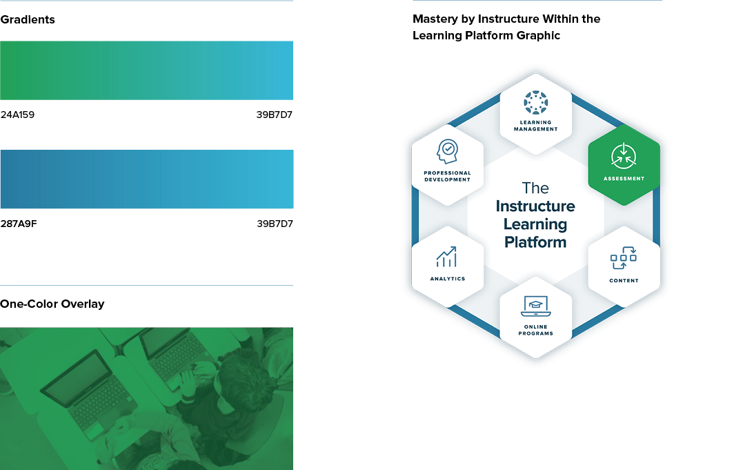
Within the Instructure Ed-cosystem Graphic
The assessment section is green.
Icons
Mastery by Instructure icons are kind of their own micro-language. These little symbols help illustrate important concepts and actions related to our products.