The Instructure Brand
Logo (Horizontal)
Usage Rules
- The Instructure logo consists of blue (PMS 2150), yellow (PMS 109), orange (PMS 144), and red (PMS 1788C).
- Whenever possible, place the logo on a light background.
- It’s a friendly logo, but it has a personal bubble, so always give it plenty of breathing room.
- To the right you’ll find the minimum logo clear space requirements and permitted permutations.
- Our logo and wordmark were made for each other, and should appear together whenever possible.
Horizontal Logo and Wordmark

Single Mark
Reversed

Logo Clear Space
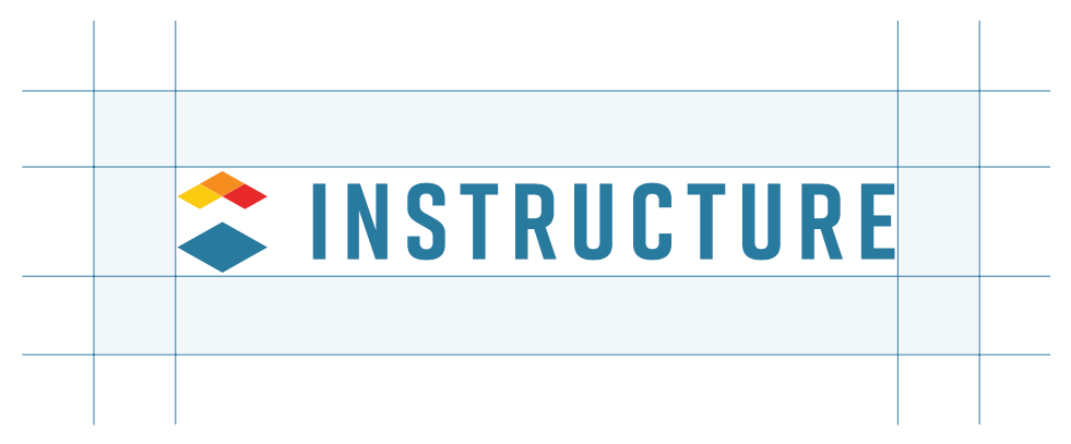
Logo Minimum Size

Logo
(Stacked)
Usage Rules
Sometimes a vertically oriented logo better fits the space. If you look to the right, you’ll see the minimum logo clear space and minimum size requirements.
Horizontal Logo and Wordmark

Logo Clear Space
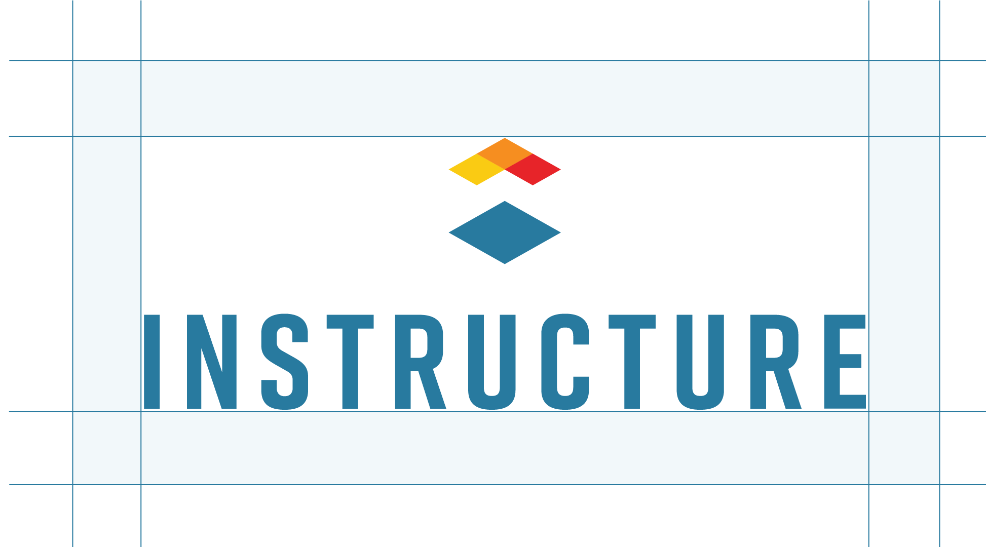
Logo Minimum Size

Logo Don’ts
-
Don’t use old Instructure logos.
-
Don’t place the logo on a busy background or use it in combinations that don’t meet AIM accessibility.
-
Don’t distort the logo by warping it, stretching it, or scaling it disproportionately.
-
Don’t adjust the colors or use gradients.
-
Don’t add any components to/remove any components from the logo.
-
Don’t add drop shadows, outlines, or textures.
-
Don’t do any of the additional “don’ts” illustrated to the right.
Don't use color combinations that don't meet AIM accessibility.
Don’t use colors that aren’t approved in our branding guidelines.
Don’t use a colorful logo on a black background.
Don’t distort the logo.
Don’t rotate the logo.
Don’t use a stroke in the logo.
Don’t use the logo in a sentence.
Don’t use the wordmark by itself.
Don’t use a gradient in the logo.
Color Palette
Primary Colors
The Instructure brand has three primary colors, chosen for both aesthetic and accessibility purposes. They’re Instructure blue (PMS 2149), red (PMS 1788), and orange (PMS 144).
Secondary Colors
Our secondary colors are for supplementary use—in outlines, buttons, divisions, illustrations, and color accents. The little things. Our handy “Palette Usage” graphic will help you determine usage frequency.
White Space
We give our colors room to breathe. So embrace the white space.
Primary Colors
-
H 287A9F
R 40
G 122
B 159PMS 2149C
C 85
M 45
Y 25
K 0 -
H E72429
R 231
G 36
B 41PMS 1788C
C 0
M 100
Y 95
K 0 -
H F68E20
R 246
G 142
B 32PMS 144C
C 0
M 55
Y 100
K 0
Secondary Colors
-
H FACB13
R 250
G 203
B 19PMS 109C
C 0
M 20
Y 100
K 0 -
H 24A159
R 36
G 161
B 89PMS 347C
C 85
M 10
Y 90
K 0 -
H 43CA9E
R 67
G 202
B 158PMS 338C
C 65
M 0
Y 50
K 0 -
H 0097D3
R 0
G 151
B 211PMS 2193C
C 80
M 25
Y 0
K 0 -
H 39B7D7
R 57
G 183
B 215PMS 2915C
C 65
M 10
Y 5
K 0 -
H 8D4EA5
R 141
G 78
B 165PMS 258C
C 50
M 80
Y 5
K 0 -
H CC1B5D
R 204
G 27
B 93PMS 205C
C 15
M 100
Y 50
K 0 -
H F76400
R 247
G 100
B 0PMS 021C
C 0
M 80
Y 100
K 0
-
H 0D323F
R 13
G 50
B 63PMS 533C
C 90
M 65
Y 50
K 50 -
H 143D50
R 20
G 61
B 80PMS 534C
C 90
M 65
Y 50
K 40 -
H 156380
R 21
G 99
B 128PMS 7700C
C 90
M 55
Y 35
K 20 -
H CCDCE4
R 204
G 220
B 228PMS 2707C
C 15
M 5
Y 5
K 0 -
H F2F8FA
R 242
G 247
B 250PMS 656C
C 6
M 2
Y 2
K 0
Palette Usage
Color Don'ts
-
Don’t use colors that aren’t on our list (even if they look “close enough”).
-
Don’t use secondary colors for headers.
-
Don’t use color on body copy. However, headlines, subheads, and titles are okay.
-
Don’t mix too many colors and gradients, causing a rainbow effect.
Our mission is to elevate student success, amplify the power of teaching, and inspire everyone to learn together.
Too Many Colors
Through software, content, professional development, open integrations, and an amazing user community, The Instructure Ed-cosystem makes edtech more personal and student success more equitable.
Gradients
Color gradients using primary colors and their tonal neighbors add dimension and variety, and help make our site more accessible. Please use them in moderation.
287A9F
0097D3
156380
287A9F
E72429
F68E20
F68E20
FACB13
Instructure Ed-cosystem Graphic
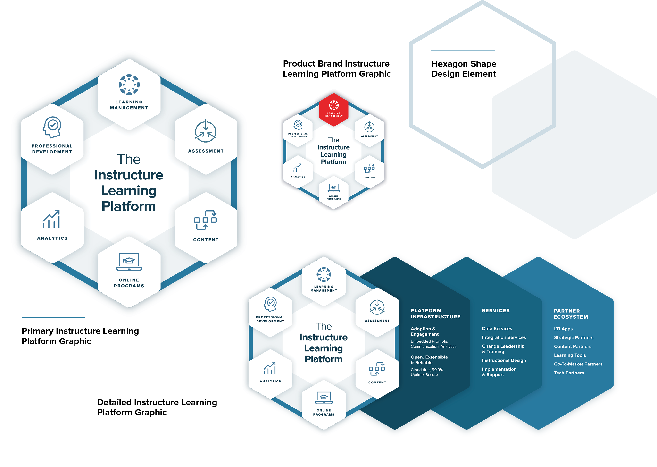
The Instructure Ed-cosystem graphic provides a snapshot of our product-brand ecosystem. It’s a helpful tool for showing how our offerings work together to amplify teaching and elevate learning, leading to improved outcomes.
The graphic’s hexagon shape, which echoes that of the Instructure logo, can be used on its own as a design element for visual emphasis—particularly as a clipping mask for photography or illustration, or a container for messaging.
Typography
Proxima Nova
Proxima Nova is our primary typeface. It’s clean and modern, just like our products. When Proxima Nova is unavailable or impractical, Arial is our recommended substitute.
Proxima Nova Extra Bold
Proxima Nova Extra Bold Italic
Proxima Nova Bold
Tiempos
Tiempos Headline is our serif typeface. Use it for accents, numbers, and quotes. When Tiempos Headline is unavailable or impractical, use Proxima Nova.
Tiempos Headline Bold
Tiempos Headline Bold Italic
Tiempos Numbers 12345678910
Photography
We keep our photography simple and strong. Whenever possible:
-
Show real people whose lives have been positively affected by Instructure and its products.
-
Evoke optimism and highlight humanity through thoughtful lighting and careful composition—even with stock images.
-
Represent the diverse backgrounds, abilities, ethnicities, ages, etc. of the millions of people Instructure impacts every day.
-
Show the technology aspect of our brand when it makes sense, while always keeping humanity in mind.
-
When taking photographs that don’t include people, look for unconventional and compelling ways to handle composition and perspective.
-
Incorporate brand colors wherever possible.
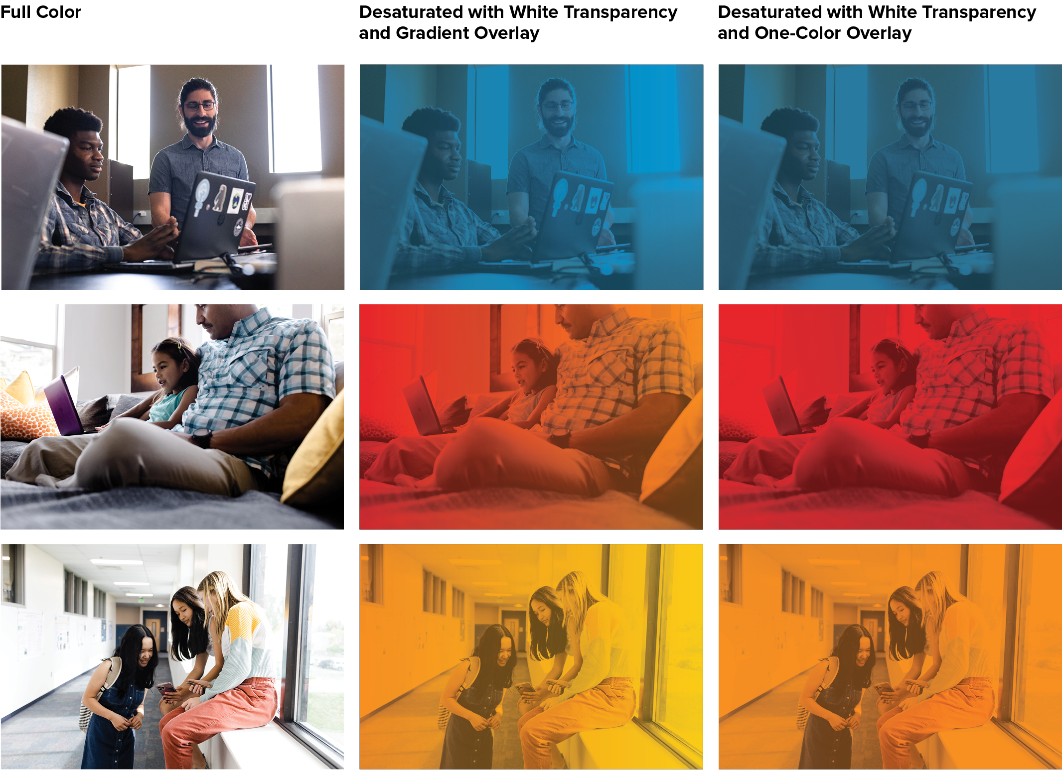
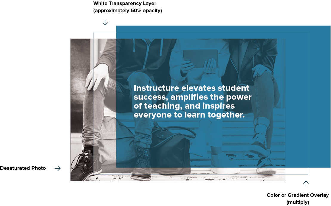
Transparency Use
Photos With Text Overlays
What do you do when you want words on top of a photo? But need it to be accessible so everyone can read it? You desaturate the photo, insert a white transparency layer, and then apply another transparency on top.
Photography Don’ts
-
Don’t use just people on white backgrounds. Keep them in their educational or work environment.
-
Don’t show subjects looking right at the camera. Photographs should feel candid, not posed.
-
Don’t use the kind of composited photos often found on stock image websites.
-
Don’t use cliché images (a bunch of people pointing at a laptop screen, a teacher writing a math equation on a chalkboard while students smile too excitedly, etc.).
-
Don’t show out-of-date technology.
-
Don’t use images that are visual puns or otherwise silly.

Videography
Sharing Real Stories
The people who use our products are some of the most inspiring individuals we know. They’re passionate educators who make the world—and our products—ever better. They’re also our greatest ambassadors. When we feature them in video, we use understated production techniques and clean, minimalist aesthetics to tell their stories simply and authentically, without getting in the way.
Conducting Interviews
Locations should have natural light and be spacious and quiet, yet visually interesting. (More a library or a classroom with windows, less an office or studio.) Remind subjects to look at and speak to the interviewer off camera, not at the camera, so it doesn’t feel like an infomercial. Keep things informal and conversational to inspire subjects’ most relaxed and authentic delivery.
Production Techniques
- The goal is to enhance the story’s content and themes. So avoid techniques that draw attention to themselves.
- Yes to smooth dolly, pans, tilts, timelapse, and drone shots. Not to shaky handhelds, snap zooms, and fast pans.
- Use natural light where possible (supplement as needed).
- Compose shots that are both authentic and visually interesting.
- Libraries, classrooms, or labs with personality make great locations and add contextual detail. Avoid areas that feel confined, stuffy, or sterile.
B-Roll
We like to show our subjects’ unique teaching and learning environments and don’t want to just stare at a talking head for the entire video. So make sure to film some “observational” b-roll for each person interviewed.
For example:
- Campus/community establishing shots (wide exteriors work great)
- Moments of teaching, learning, and collaboration with devices and digital tools in use
- Other expositional and detailed shots that suit the story
Post-Production
While we want our edits to be engaging and compelling, we also need to focus on the featured people and their stories. So we take an understated approach to post-production. Use straight cuts, for example, and avoid overusing conspicuous transitions like long cross dissolves, wipes, and zooms.
Music
Music is vital to our video storytelling. Of course, the tone of a user story is different from an event-highlight reel or other promotion. But there are some common traits: We always look for music that’s emotive and not overly produced. And ideally it will age well. Check out our recent videos for a sense of what we’re going for.
References
See our YouTube video library for reference (and, hopefully, inspiration) and reach out to the Instructure creative team for direction, review, and approval.
.
Illustrations
The selective use of illustrations can help us tell or enrich a story visually in reports, infographics, and other materials.
Character Illustrations
We use bespoke character illustrations that amplify and elevate our brand with a distinctive style, subject matter, and color palette.

User Interface Illustrations
These illustrations use wireframes that echo the user experience in our ecosystem—helping to reinforce our brand mission, values, and voice with simple, clean lines that add visual interest.

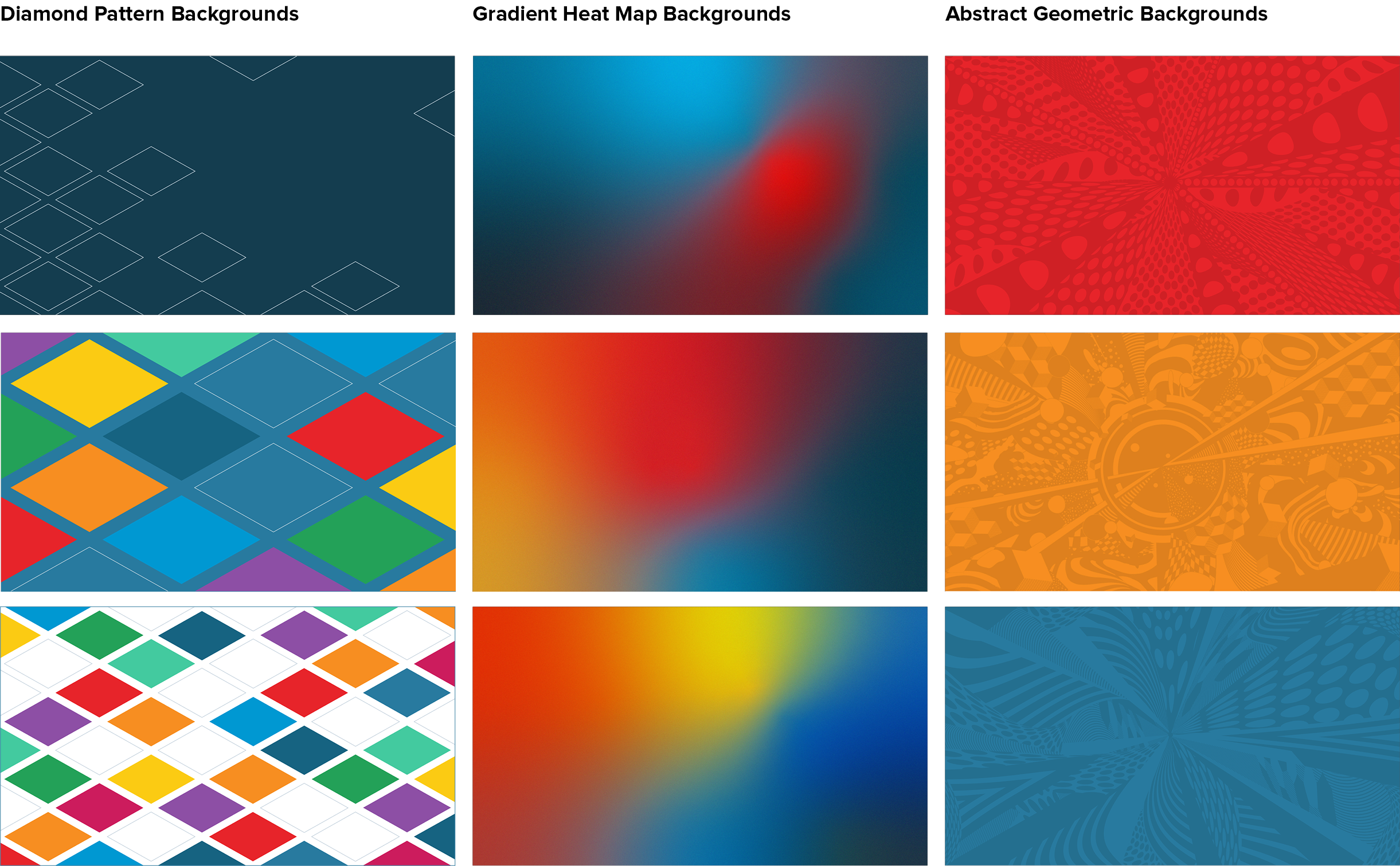
Backgrounds + Patterns
The diamond pattern, gradient heat map, and abstract geometric backgrounds visually strengthen our brand by repeating the Instructure logo shape, creating unique branded color experiences, and adding texture and depth.
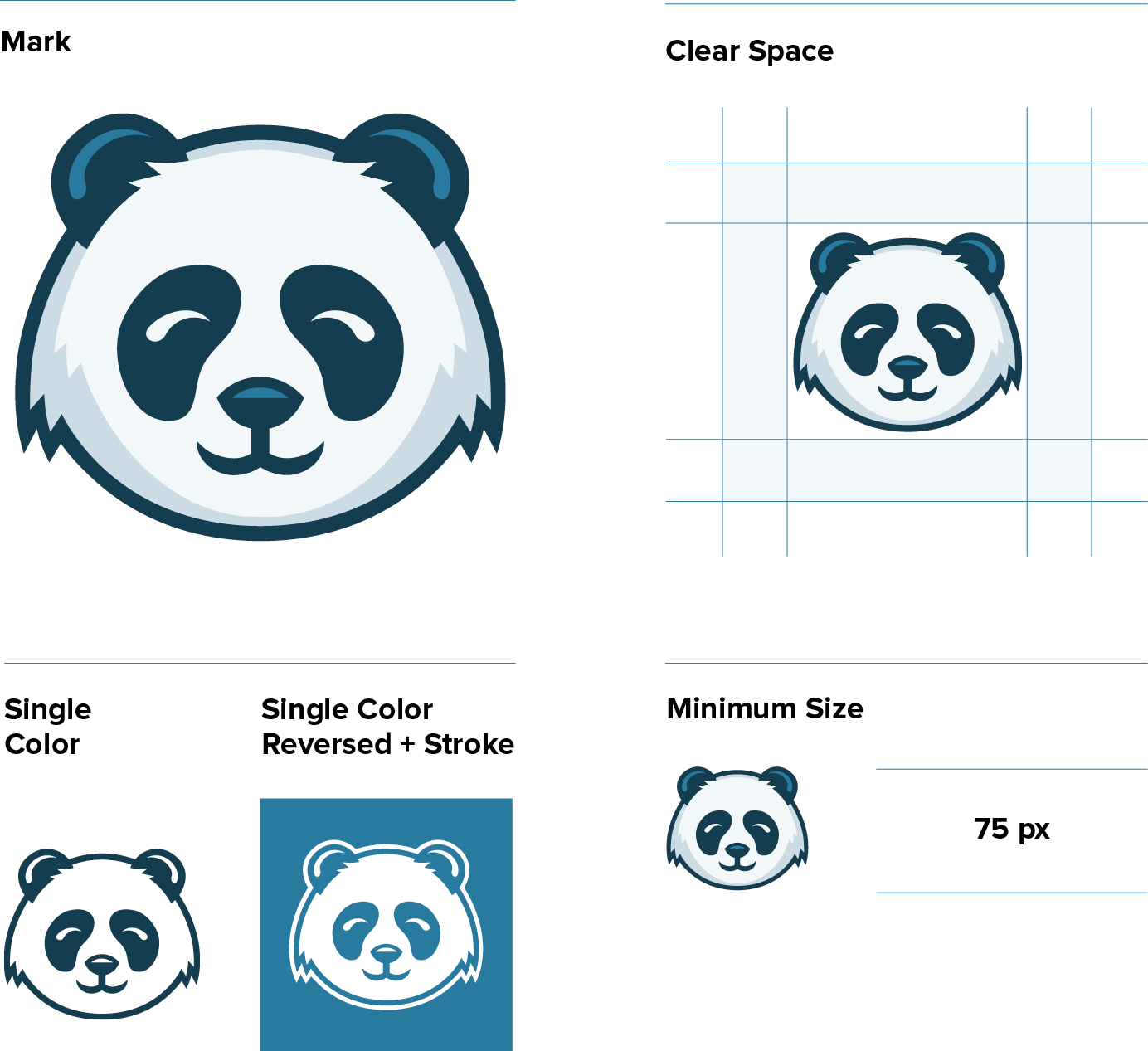
Spirit Mark
What’s up with the Panda?
We get this a lot. Way back when Instructure first began, our founders were short on staff—so they put a giant stuffed panda at the receptionist desk, just for fun. Little did they know, one day that panda would become a beloved yet mysterious part of our brand.
Always protect the panda.
We don’t want the panda to go from a charming mascot to an overused annoyance, or a source of confusion for our customers. So never use the panda without checking with the brand team first. No unapproved panda materials are allowed for external use.
Usage Rules
-
The Instructure panda spirit mark consists of dark blue (PMS 533C), blue (PMS 2149C), and light blue (PMS 2707C).
-
When using the panda, you must integrate the full Instructure logo into your design.
-
It’s an approachable panda, but it’s still a wild animal, so always give it plenty of clear space, as shown at left.
-
Always use the panda at a size larger than 75 px.
-
Never use the panda without permission.
-
Don’t change the panda in any way—including its colors, shape, or expression—and don’t add or subtract any elements.
-
Don’t use older versions of the panda.
-
Don’t use the panda without a reference to Instructure.
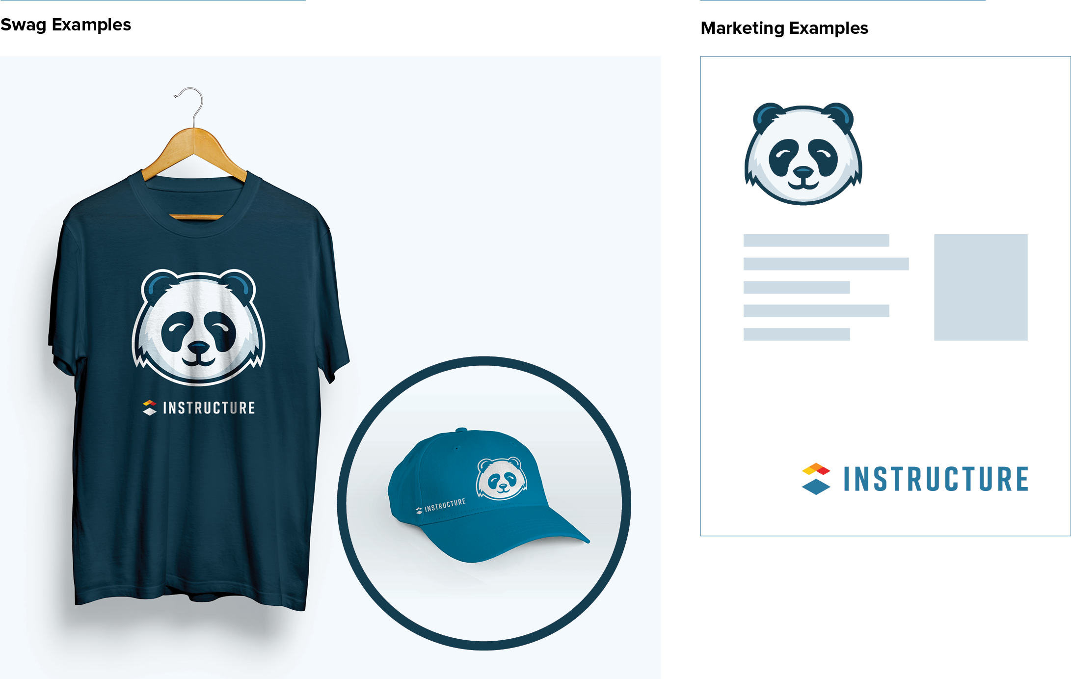
Instructure Logo + Spirit Mark
Our panda spirit mark is part of our Instructure corporate brand, but it’s
not meant to replace our Instructure logo. Instructure branding must remain omnipresent to connect the panda with our overarching mission. Here are a few examples of how to integrate the spirit mark into your design with the combined Instructure logo and wordmark.
Printing Guidelines
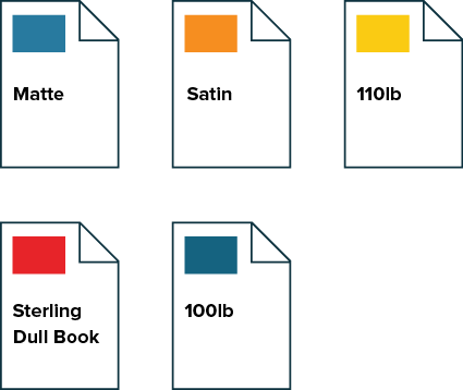
Always print Instructure materials on 110-lb matte or satin-paper finish paper. Nothing glossy whatsoever.