
2025
Living Component Page
This page represent all of the available components on instructure.com and their variations.
- Please note this is not all encompassing!

Microheading
Text component heading
The Basic Text component is used for standard body copy across the site. It ensures consistency in typography, spacing, and accessibility. Use this component for paragraphs, instructions, and other general content where a simple text treatment is needed.

Text component
Usage guidelines
This is a basic text component. It provides a consistent reading experience across all pages and adapts responsively to different screen sizes.
-
Ideal for body text, descriptions, and non-heading content.
-
Supports semantic HTML tags (e.g., <p>, <strong>, <em>) for accessibility and SEO.
-
Default text should follow brand voice and tone standards.
Text component features
Cards (up to 5 suggested)
Use cards to break down supporting details or list features related to the main text block.
Modular by Design
Components are built for flexibility—easily rearranged to meet evolving content needs.
Responsive Out of the Box
Each card automatically adjusts to screen size and layout, maintaining usability across devices.
Editor-Friendly
With clear fields for headline and body text for easy updates.
Brand-Aligned Styling
All typography, spacing, and borders follow the global design tokens—no custom overrides needed.
Optimized for Accessibility
Cards support semantic HTML and pass WCAG 2.2 AA standards by default for color contrast and readability.
Text component
Optional Highlight Block
Use the Mission Statement style to call out bold messaging or unique positioning. This variant is ideal for emphasizing brand values, strategic priorities, or high-impact content.
You can include a mission statement
This layout is ideal for reinforcing purpose-driven messaging.
Logos Bar - rotating

Logo Grid
Description / Microheading

Component:
CTA Banner
CTA Banner
Use this component when you need a high-visibility call-to-action at the mid or bottom of a landing page. Ideal for campaigns, product promotions, lead generation, or key messaging.
Component: Benefit Cards
Use this component to highlight individual integrations, services, or platform capabilities. Benefit Cards are best used in groups (3–5 cards) to surface a collection of related features, partners, or use cases. Each card includes a logo or icon, headline, body text, and optional CTA.
Microheading
Heading: Benefit Cards Grid
Appears at the top or bottom. Recommended for brand recognizability or visual enhancement.
Appears at the top (for logos like Google or Zoom) or bottom (as shown in the “Manage across the enterprise” card). Recommended for brand recognizability or visual enhancement.
Clear, concise benefit or feature name. Should be short and scannable (1 line preferred).
Body Text (required): 2–3 sentences max. Use to briefly explain the feature, partnership, or benefit. Aim for plain language and action-oriented phrasing.
Use “Learn More” or a custom link label to drive traffic to a supporting page. If omitted, the card can be static.
Microheading
Heading for Benefit Cards Slider
Benefit Cards are best used in groups (3–5 cards) to surface a collection of related features, partners, or use cases.
The icon or logo can be positioned at the top or bottom.
CTA Banner
Standard CTA w/ form
Standard CTA w/ form
Use this component when you need a high-visibility call-to-action at the top or bottom of a landing page. Ideal for campaigns, product promotions, lead generation, or key messaging.
Microheading
Microheading
Three-Column Content

Title (optional)
- Title is main label for the content block. Keep it short and descriptive.
- Subtitle is used to add supporting context or categorize the card further.

Image
Optional but encouraged. Appears above the text and helps visually differentiate each card. Use high-quality, relevant imagery.

Title
Description (optional) - Use 1–2 short sentences to elaborate on what the user can expect when engaging with this content.

4+ Listing
This component will shift to a new row when 4+ items are added.
Stats Card Grid
customers
We have customers all over the globe—in over 100 countries, in fact.
community members
Instructure hosts the world's largest online community of educators and edtechnologists.
LMS in the world
Yes, we make Canvas—the LMS that's simple to use, easy to love, and built for a lifetime of learning.
assessment scores created via Mastery
That's a whole lot of formative, predictive, and college prep work.
K–12 schools love Parchment
It's the preferred platform for enrollment, records management, and credentialing.
Testimonial Carousel
Featured Asset Carousel


Banner with Rounded Corners
Banner with Rounded Corners
Use this CTA Banner variant for smaller campaigns, events, or announcements. Works well mid-page or as a soft conversion opportunity.
Microheading
Product Cards Detailed
Product Cards are managed in the Product Card section of their corresponding product page. In addition to these, you can create and add custom cards that use the same available fields.
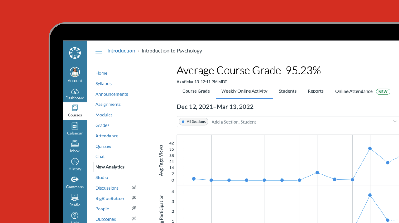
Canvas
Open, adaptable, user friendly, and future ready—Canvas is North America's most-loved learning management system.
Canvas is built for:
- efficient, effective teaching
- equitable, accessible learning
- flexible, scalable integration
- community-powered innovation
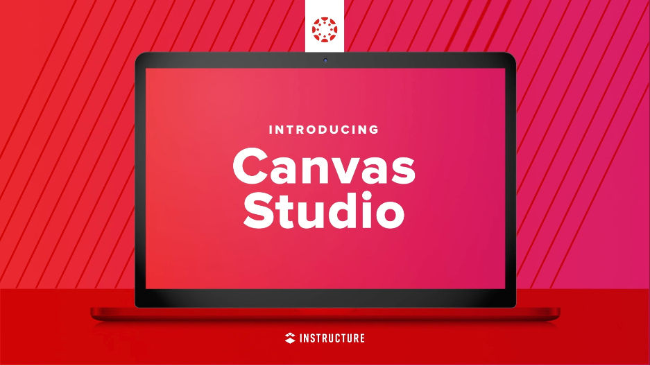
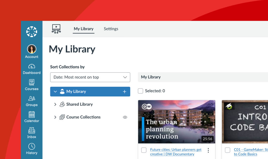
Canvas Studio
Canvas Studio is the two-way video platform that turns passive watching into active learning.
Canvas Studio is built for:
- seamless video creation and sharing
- interactive discussions inside the video timeline
- actionable analytics to track engagement
- integration across courses, devices, and the Canvas LMS
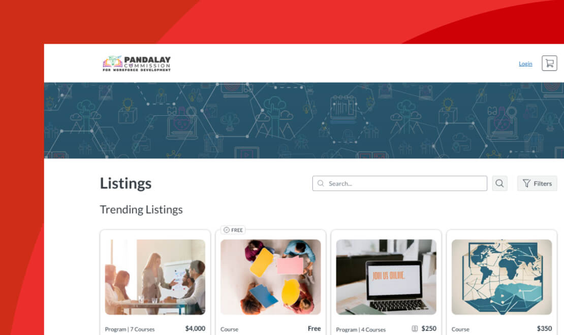
Canvas Catalog
Canvas Catalog allows you to promote, centralize, and brand your continuing education and professional learning programs in an online marketplace.
Canvas Catalog is built for:
- discoverable course listings and programs
- seamless enrollment and payment workflows
- professional, continuing, and vocational learning
- custom branding and configuration
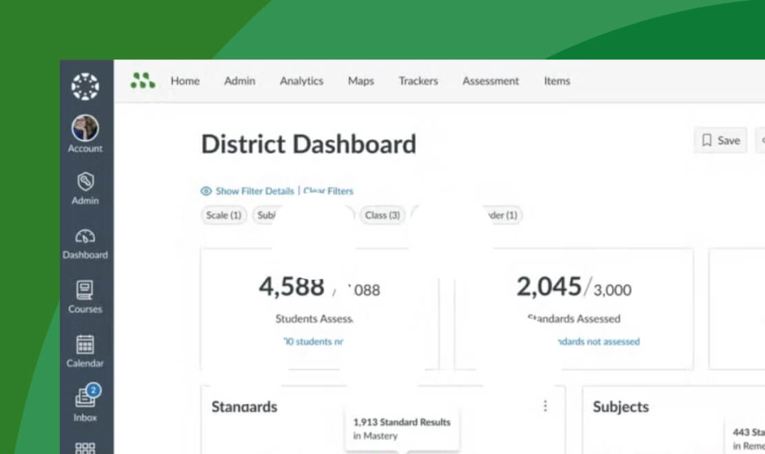
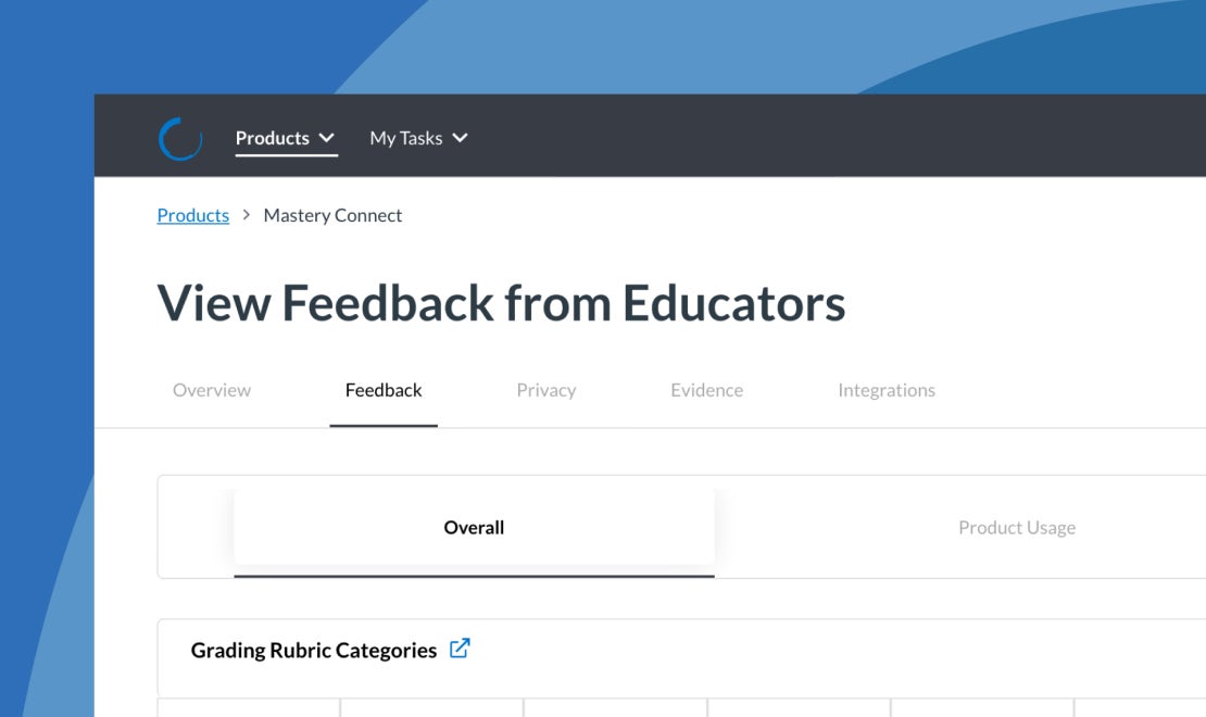
Mastery Connect
Reliable, research-based, and standards-aligned—Mastery helps educators track learning with confidence.
Mastery Item Banks was built for:
- creating valid, high-quality assessments
- measuring mastery across standards
- driving data-informed instruction
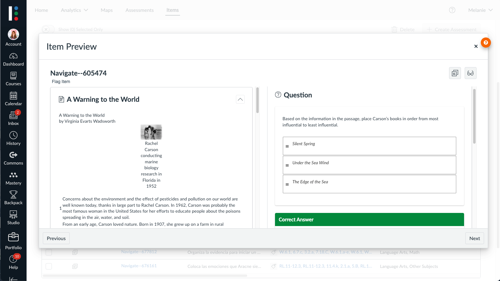
Mastery Item Bank
Mastery Item Bank gives educators the expert-built, standards-aligned, and classroom-ready content they need to create meaningful assessments.
With Mastery Item Bank you can:
- save time with pre-vetted assessments
- align instruction to standards
- receive instant feedback for better outcomes
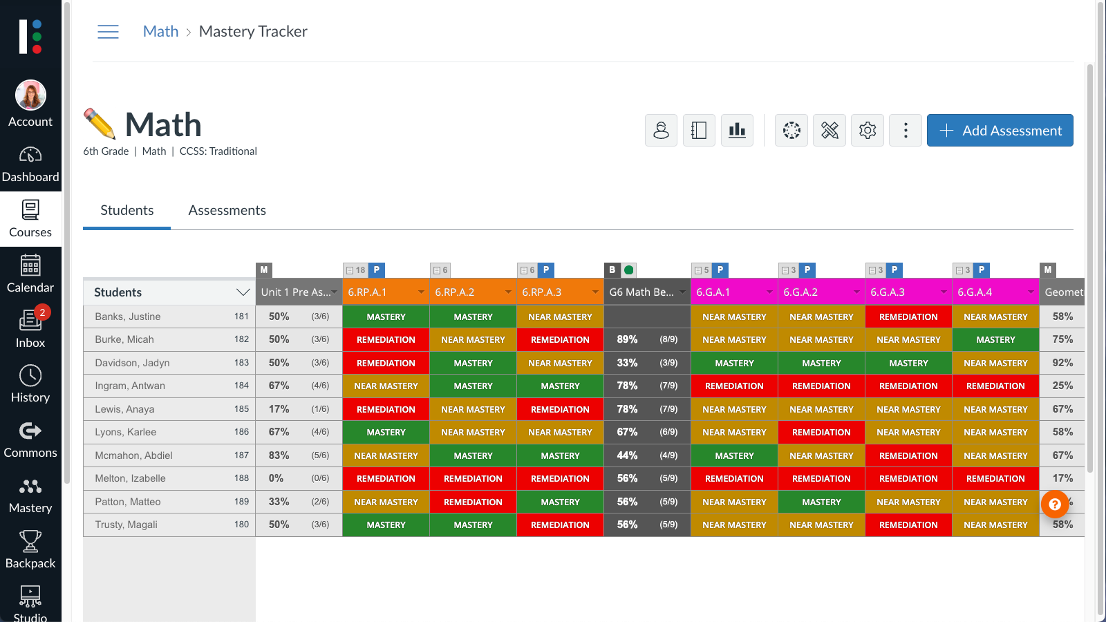
Mastery Assessments
Mastery Assessments help educators predict outcomes for state assessments and improve student outcomes.
Mastery Assessment is built to help you:
- accurately predict student performance on year-end state assessment
- support formative and summative assessment
- individualize student learning strategies
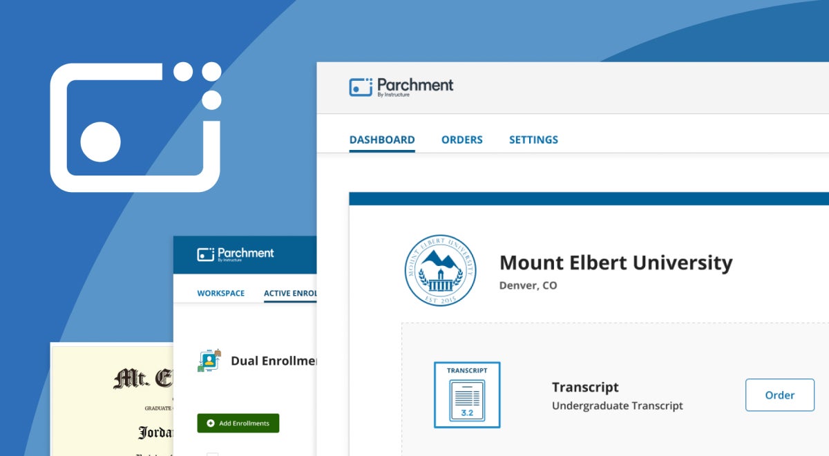
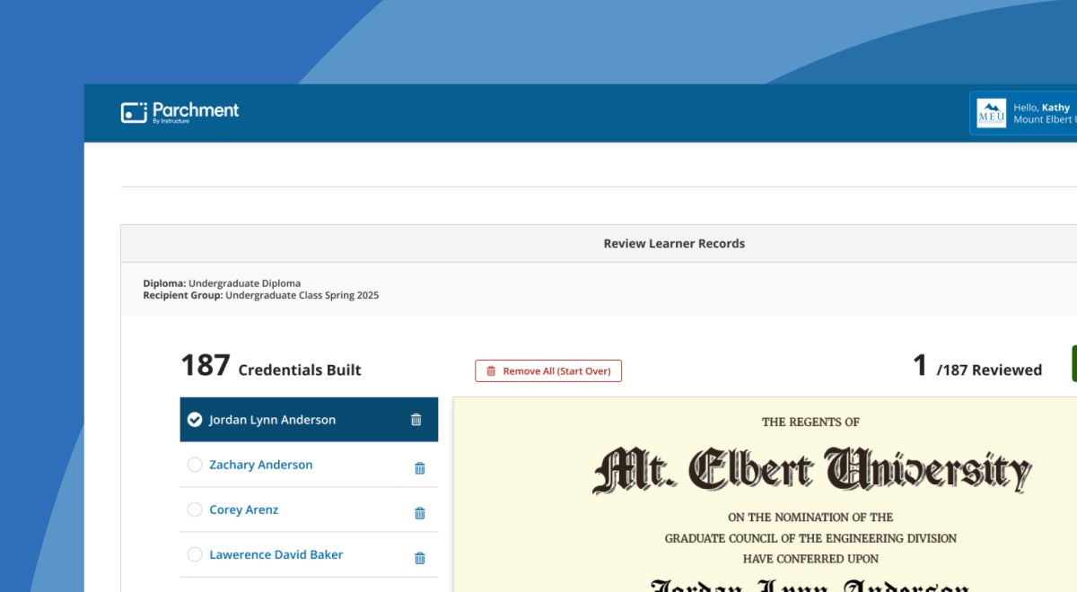
Parchment
Trusted and secure, Parchment makes it easy to send, receive, and verify academic credentials anytime, anywhere.
With Parchment you can:
- streamline transcript and credential delivery
- empower learners with lifelong records
- support mobility across schools, states, and careers
- deliver digital badging and credentialing
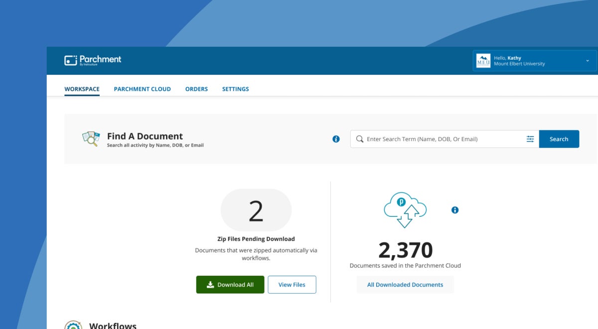
Parchment Award
Parchment Award simplifies credential management and reduces administrative burden, ensuring learners have fast, easy access to their records.
With Parchment Award you can:
- simplify records management
- keep credentials secure with end-to-end encryption
- easily manage every credential type
- provide learners with digital access to all their records
Parchment Pathways
Parchment Pathways helps students navigate their journey from education to opportunity.
Parchment Pathways was built to:
- efficiently help students transfer their records and credentials
- speed up admissions decisions
- guide learners through academic and career options
- connect credentials to real-world learning
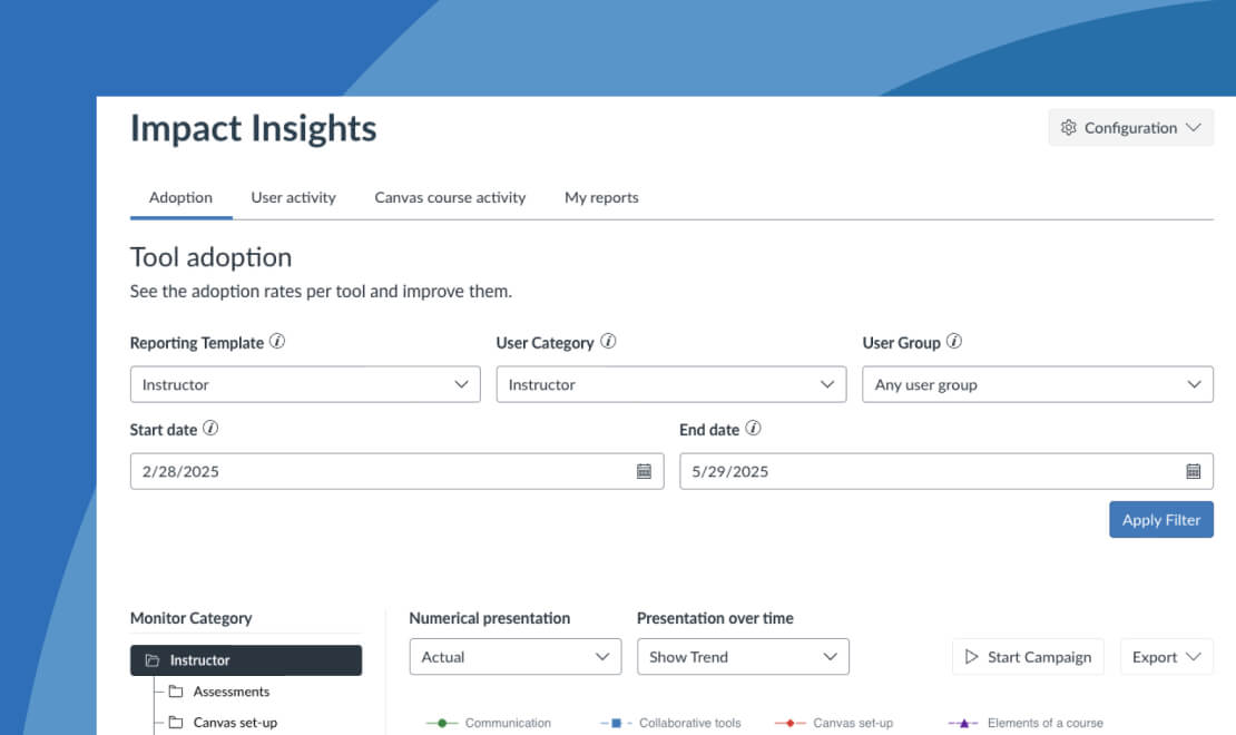
Impact by Instructure
Actionable, embedded, and built for education, Impact helps you drive adoption and prove edtech ROI.
Impact was built for:
- measuring LMS and tool usage in real time
- guiding users with in-app messaging and support
- improving outcomes with data-informed decisions
LearnPlatform EdTech Effectiveness
LearnPlatform helps K–12 schools manage their edtech ecosystems with clarity and control.
With LearnPlatform you can:
- track edtech usage and improve ROI
- streamline edtech approvals and feedback
- make fast, evidence-based decisions

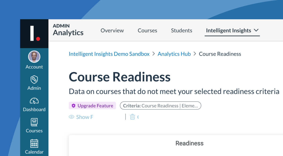
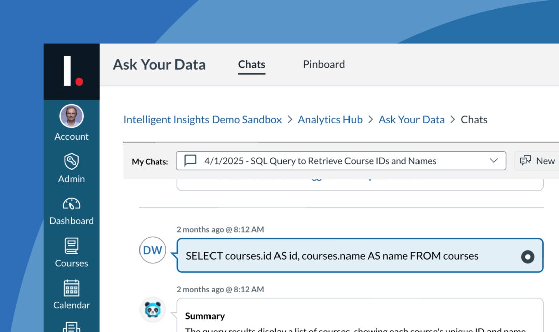
Intelligent Insights
AI-powered and built for impact, Intelligent Insights helps you turn Canvas data into student success.
Intelligent Insights is perfect for:
- spotting trends and struggling students in real time
- customizing analytics to meet institutional goals
- accelerating decisions with conversational AI and shareable insights

IgniteAI
Flexible, transparent, and built specifically for educators, IgniteAI brings powerful AI tools into the flow of teaching and learning.
With Ignite AI you can:
- Streamline tasks like grading, content creation, and analysis
- Ensure transparency with AI “Nutrition Facts”
- Integrate AI seamlessly across Instructure products

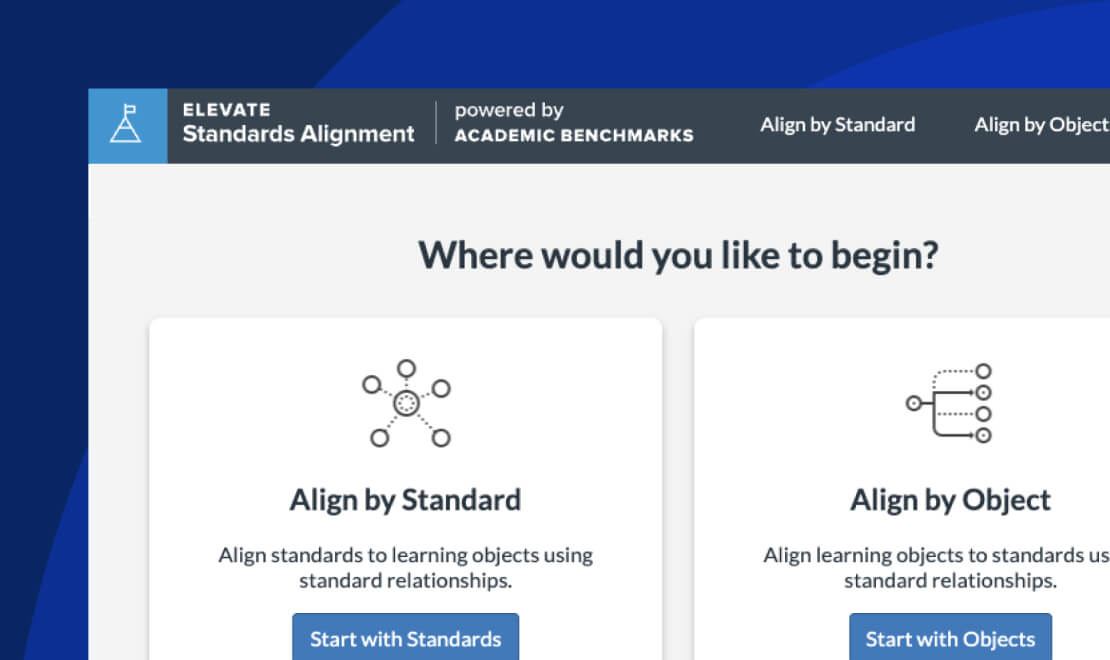
Elevate Standards Alignment
Elevate Standards Alignment simplifies how you manage, tag, and scale content across evolving academic standards.
Elevate Standards Alignment was built for:
- tagging content with AI-powered precision
- mapping across state, national, and custom frameworks
- equipping teams with actionable reports and trusted standards
Mastery Item Bank
Rigorous, ready, and classroom-tested—Mastery Item Bank delivers the high-quality content educators need to build effective formative assessments.
With Mastery Item Bank you can:
- align to state and national standards
- support diverse learners with varied item types
- provide meaningful data through expertly tagged content
LearnPlatform Evidence as a Service
Insight-rich, compliance-ready, and impact-focused—LearnPlatform helps K–12 leaders evaluate, manage, and improve their edtech ecosystem.
LearnPlatform was created to help you:
- track and analyzing tool effectiveness and ROI
- ensure privacy compliance with FERPA, COPPA, and more
- streamline approvals to surface what drives student outcomes
People Component

Steve Daly

Melissa Loble

Rachel Orston

Shiren Vijiasingam

Matt Kaminer

Michael Lysaght

Armin Molavi

James Sutton

CTA Banner
Optional visual variant
Optional visual variant
Use when showcasing community, user stories, or personal connection to your brand.